Posts
Installation: A Shelter
- Get link
- Other Apps
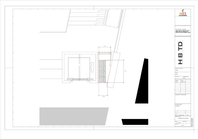
Continuing from the previous group, I worked with Beck, Dylan, and Theresa to create a 1:1 model. We found an unused and wasteful piece of land and decided to transform it into a place for people to rest or vent their emotions. We initially planned to create a closed space that could isolate all external sounds. But then we realized that overly enclosed spaces may not be conducive to people's emotional release, and may exacerbate people's tension. And in a confined space, people will not know that there is someone inside. Even if there is a door lock, people outside will still disturb people inside when they try to open the door. So we changed to a semi-enclosed space, using a semi-transparent material called thin cloth to connect with the outside. Firstly, we made a wooden frame as the main structure. In order to support it against the wall, we built two horizontal wooden strips. Because the adjacent elevator is transparent, we wanted to avoid eye contact
Tempietto
- Get link
- Other Apps
Tempietto is a representative building of the Renaissance style designed and built by Donato Bramante. Tempietto was built in memory of St. Peter. When Donato Bramante designed Tempietto, he referred to the style of ancient Roman architecture. Especially columns. The consensus of architects at that time was that different architectural column styles should be used to commemorate different people or gods. Donato Bramante used the Doric order of ancient Rome in order to make the whole building more consistent with the concept of commemorating St. Peter. This also shows that Donato Bramante does not blindly pursue classical style, but combines it with spiritual connotation. This is also a prominent feature of Renaissance architecture. Donato Bramante emphasizes volume. In Tempietto's plan, he used two geometric patterns of circle and square, which made the whole building full of changes. There is a strong sense of the existence of a circle of columns around the periphery
Ospedale Degli Innocenti
- Get link
- Other Apps
Ospedale Degli Innocenti is a public building designed by Brunelleschi in 1419. This is the first Renaissance style building in the history of architecture. Brunelleschi studied a large number of ancient Roman and Greek buildings in his early years, so he was able to combine the architectural style with the times while retaining the classical elements. The public buildings of his era used a large number of arched colonnades. Brunelleschi continued to use this design but changed the decoration of the column top to Corinthian order. And he designed the bay plane of the arch as a square, which is a very traditional classical style. Interestingly, Brunelleschi avoided the use of the Gothic style. When designing the dome of the Cathedral of Florence, the Gothic style of the dome conformed to the mechanical design, so he compromised. When designing Ospedale Degli Innocenti, he designed the arch contour very smoothly, instead of having a sharp corner on it like the Gothic arch. Brun
Palazzo Medici: A milestone in palazzo architecture
- Get link
- Other Apps
The Palazzo Medici Michelozzo designed is a typical Renaissance style building, which means there is no major innovation, but it also follows some classical concepts. The first is the architectural facade design, and the Palazzo Medici is famous for its rustication design and the rough to smooth transition from bottom to top. It only has three floors, but the scale is grand, with each floor exceeding 20 feet high. And at that time, the nobles preferred to use stones to build palaces, in order to highlight the grandeur of the palaces. Because at this time, the stone was the most expensive building material in Florence, which can also indirectly show the wealth of the family. In the Palazzo Medici, Michelozzo used stone to build the exterior wall, but he added the design of Rustication. Rustication extends from the bottom to the roof, creating a steady appearance. And from bottom to top, the stones in each layer become smoother and smoother, visually enhancing the magnifi
A vent house that isolates the outside world
- Get link
- Other Apps
When I was conceptualizing my final assignment, I came up with the concept of an outlet room. Recently, students have been under increasing pressure, and I often feel pressure while working in the studio. So I think we need a place to carry our emotions. This place should be filled with plush things. Because I think soft things can help people quickly relax. I made a model for this, where external questioning or slander is like a shattered glass cover, while the soft fabric isolates these fragments and protects the people in the middle. The clay person in the middle represents different emotions, and all emotions can be expressed in this room.
Exploration of Village Architecture——Container building
- Get link
- Other Apps
This semester, I went to many villages to observe people's buildings, and I found many interesting houses in the village. For example, the prefabricated house in this article. It is built with many different materials and looks like a messy combination. Its connection is not perfectly processed, and the iron sheet is only attached to the insulation material, not connected to the concrete below. The insulation layer is only attached to the iron pillar, and a part of the iron sheet has already fallen off. Its overall structure is very strange, with different materials spliced together and seemingly unrelated to each other, making it an unattractive building. But in fact, this is the norm in Chinese rural architecture. There are many workers in rural China who have high mobility and only demand cheap rent for housing. So there are many such container houses in rural China. This type of house is easy to dismantle and move, which is in line with the characteristics of hig
Design a Toilet
- Get link
- Other Apps
I was in a team with Beck, Dylan, and Theresa to design a 10m² toilet , and I was responsible for designing the floor plan of the toilet. Our designed size is 2.5m × 4m. A 10m² toilet is relatively large in ordinary houses, so I designed a wet and dry separation toilet. Wet and dry separation can reduce the humidity of the toilet and improve the comfort of residents. In addition, I have designed a large bathtub. Although the shower room already meets the bathroom's essential flushing function, I believe the bathtub is the most relaxing toilet tool. The window I designed is in the middle, so people's activities in the toilet cannot be directly seen from outside. This is based on privacy considerations. This is my first time designing a toilet specifically. I have changed the placement of the bathtub and toilet many times, which made me realize that things that usually look simple also require a very long time to design. This is a design that allows me to focus on
About Tulou
- Get link
- Other Apps
Tulou is a special building in Chinese traditional dwellings, which has a unique shape and special defense function. The wall of the Tulou is mainly composed of soil, which is reinforced with bamboo pieces or pine branches, similar to today's reinforced concrete. The building materials of Tulou are locally sourced, which is very environmentally friendly. Tulou came into being in the Song and Yuan Dynasties and developed rapidly in the late Yuan Dynasty and early Ming Dynasty. This is an important period for the change of dynasties. In order to survive and resist the invasion of thieves, born in troubled times in the coastal Minnan area brought about disaster, the common people built Tulou, which is a family-based building with both residential and defensive functions. As a traditional Chinese residential building, the most prominent feature of Tulou is that it is a closed surrounding settlement that can accommodate the entire family, and the interior is a completely acc
Mozuna Kiko and His Grand Architectural Thought
- Get link
- Other Apps
Mozuna Kiko was born in Kushiro, Hokkaido in 1941. The vast fields and starry sky in Kushiro City formed Mozuna Kiko's initial impression of the world. Because of this broad and mysterious atmosphere, Mozuna Kiko has formed an almost infinite grand view in his architectural career. In the 1960s, postmodernism rose and led the trend of thought of liberation worldwide, and then quickly extended to the field of architecture. In the field of architecture, aesthetic diversity broke out, and various architects boldly carried out innovative designs and incorporated various humanistic concepts. In 1965, when postmodernism prevailed, Mozuna Kiko graduated from Kobe University in Japan. Under the influence of post-modernism, Mozuna Kiko formally began his exploration of architectural theory. After graduation, Mozuna Kiko first stayed at Kobe University as an assistant professor at Mukai Masaya. He founded his own office in 1978 and became a professor at Tama Art University in 1995.